Case Study 03
Learning Tailwind CSS: Becoming a more efficient developer.
The goal of this project was to learn Tailwind CSS and apply it to a real world style website.
Overview
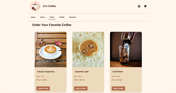
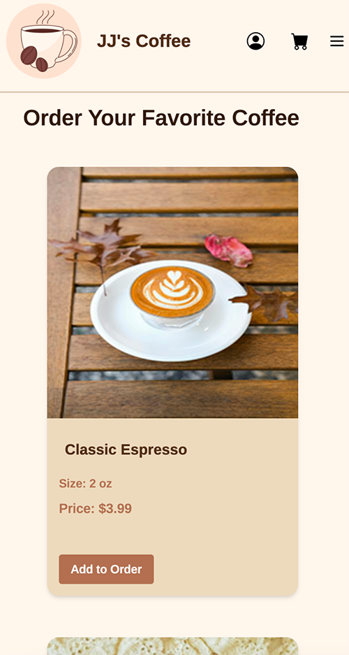
The goal of this project was to learn Tailwind CSS and apply it to a real world style website. To accomplish this, I designed and developed a fictional coffee shop website called JJ’s Coffee. The website allows users to explore the coffee shop, view menu items, read reviews, and navigate through multiple pages. This project helped me understand how Tailwind works, how utility first CSS improves workflow efficiency, and how to build a fully responsive, modern website.

The Problem With Traditional CSS & What I Learned
Before learning Tailwind CSS, I primarily used traditional CSS to style my websites. While it worked, it often became difficult to keep my design consistent across multiple pages. I had to manually reuse the same colors, spacing, and styles, which made the code harder to maintain and update. If I wanted to change something like a theme color, I had to find and edit it in many different places.
Another issue was development speed and responsive design. Writing custom CSS and media queries for every layout took extra time and made the workflow less efficient. Tailwind CSS solves these problems by providing utility classes and customizable theme variables, allowing me to build faster while keeping the design consistent across the entire website.
Tailwind CSS

Traditional CSS
The Solution Why I Chose Tailwind CSS
To solve these problems, I used Tailwind CSS to build the JJ’s Coffee website using a utility first approach. Instead of writing separate CSS for every component, I applied Tailwind classes directly in my HTML to control layout, spacing, colors, and typography. This allowed me to design and test elements much faster without switching between multiple files. Tailwind’s built in responsive breakpoints also made it easier to create layouts that adjust automatically for mobile, tablet, and desktop screens.
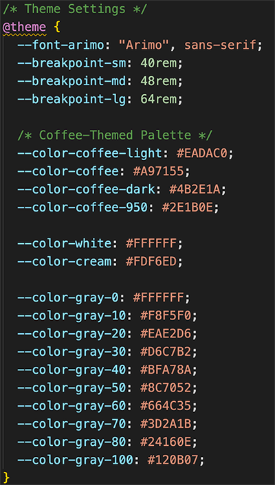
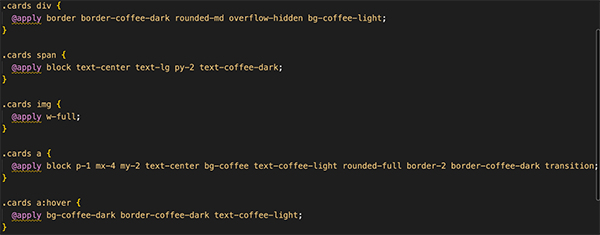
In addition to using Tailwind’s default utilities, I customized my design using my input.css file. I created theme variables for my coffee color palette, such as coffee, coffee-dark, and coffee-light, which allowed me to use consistent colors throughout the website. This made my design more organized and easier to maintain because I could reuse the same styles across multiple components. I also used Tailwind’s @apply feature to create reusable classes like my card layouts, which helped keep my code clean and consistent.
Keeping it Consistent JavaScript Modules & Tailwind
Using JavaScript modules was an important part of keeping this project organized. Instead of rewriting the same HTML on every page, I created separate module files for the header, navigation, and footer and imported them wherever needed. This made my code cleaner, easier to maintain, and far more efficient.
Tailwind CSS paired naturally with this approach. Since the same components were reused across every page, Tailwind's utility classes kept my site consistent with layout, spacing, and color scheme. My navigation links, for example, use classes like text-coffee-dark and hover:text-coffee to apply my custom theme colors ensuring the design stayed consistent without any extra effort. Seeing my code come together made me realize just how powerful pairing Tailwind CSS with JavaScript modules can be. What used to require managing multiple CSS files and rewriting HTML across every page was reduced to a single module and a few utility classes. It made me appreciate how much faster and more confident I can be as a developer when the right tools work together write it once, style it once, and it just works everywhere.
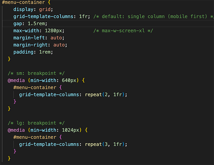
Responsive Design Using Tailwind CSS
Tailwind CSS made building a fully responsive website straightforward. Rather than writing custom media queries from scratch, I used Tailwind's responsive prefixes like sm:, md:, and lg: directly in my HTML but I didn't stop at the defaults. Using @theme in my input.css, I defined my own custom breakpoints to better suit the layout needs of the site, giving me full control over exactly when the design adapts.
A good example of this is my menu grid. On mobile, cards stack into a single column so the content is easy to scroll through. On tablets they expand to two columns, and on larger screens three all controlled with just one line of classes like grid-cols-1 sm:grid-cols-2 lg:grid-cols-3. Before Tailwind, achieving this would have meant writing and managing separate media queries in a CSS file. With Tailwind, even with custom breakpoints, everything stayed in one place and felt effortless and it made me much more conscious of designing for every screen size from the start.
Final Thoughts & Key Takeaways
Building JJ's Coffee changed how I think about front-end development. I knew traditional CSS but I was always slowed down by jumping between files, hunting repeated styles, and writing media queries. Tailwind changed that entirely.
What surprised me most was how confident it made me. Creating my own color palette with coffee, coffee-dark, and coffee-light, setting custom breakpoints with @theme, and using @apply for reusable styles showed me that Tailwind isn't just a shortcut it's a design system you can actually make your own. Pairing it with JavaScript modules was when everything clicked for me. Write it once, style it once, done. That's something I'll take into every project going forward.